Drupal FlexSlider with Carousel Controls
Drupal’s FlexSlider module allows for creation of responsive image sliders and carousels. This is perfect for creating banner slideshows, or just organizing images.
In this tutorial we are going to combine two FlexSliders. We will create a main rotation that feature images from a corresponding image carousel. A user will be able to navigate through the main rotations using the carousel as controls as seen below.

One important thing to note is that this is not the same thing as using FlexSlider’s ability to navigate using thumbnails. When using a thumbnail navigation, ALL images appear under the thumbnails. Using a carousel on the other hand keeps the design clean simple.
For this tutorial you will need to install FlexSlider, FlexSlider Library and Views. Make sure FlexSlider Views Style is enabled as we will be using Views to create the final result.

Creating the main rotation
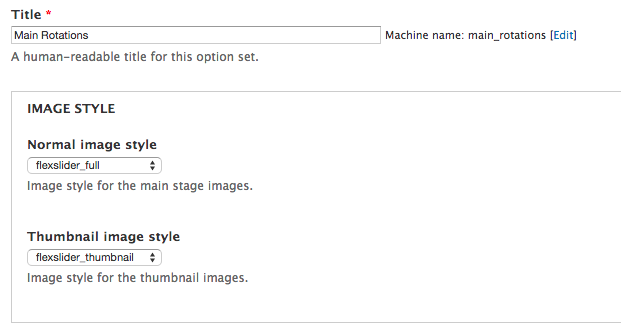
Once installed, navigate to the FlexSlider configuration page and add a new option set at admin/config/media/flexslider/add. This will be the main rotation. You can keep all the defaults under the General Slideshow and Animation Settings tab.
Under the Navigation and Control Settings tab, make sure the following are configured:
- Next/Previous Controls = unchecked
- Paging Controls = on

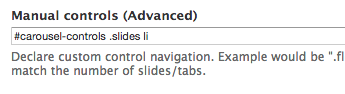
Next, under the Advanced Options tab, make sure the following are configured:
-
Manual controls (Advanced) = “#carousel-controls .slides li”
- This will be used later when creating a view
Creating the carousel controls
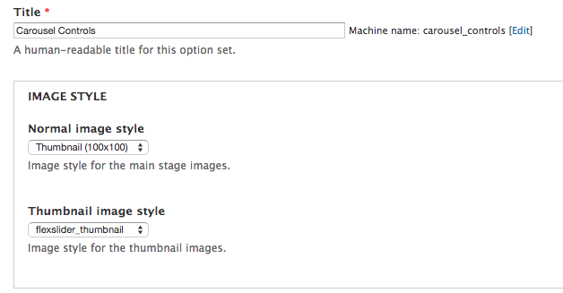
Navigate back to the FlexSlider configuration page and another option set at admin/config/media/flexslider/add. This will be the carousel controls.
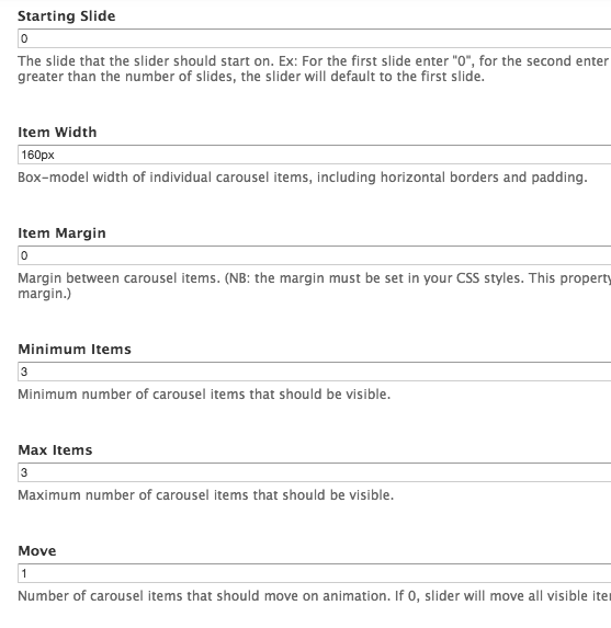
Under the General Slideshow and Animation Settings tab, make sure the following are configured:
- Animation = Slide
- Slide Direction = Horizontal
- Starting Slide = 0
- Item Width = 160px
- Item Margin = 0
- Minimum Items = 3
- Max Items = 3
- Move = 1
Creating the view
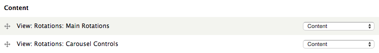
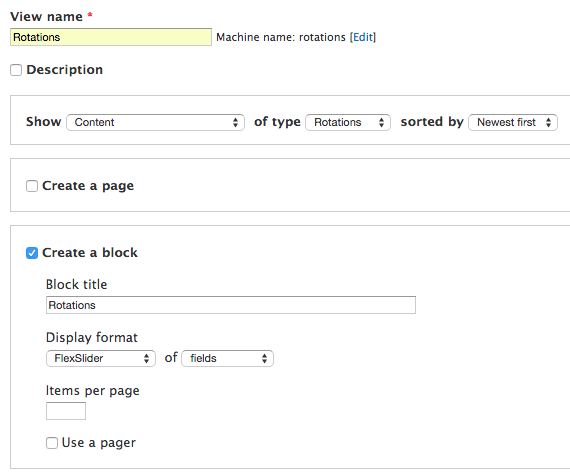
Now we are going to create a view with two block displays. In my demonstration, I created a new content type called Rotations which is holding the images for my FlexSlider. Create a new view at admin/structure/views/add and select Create a block. Select FlexSlider as the Display Format and select the output as fields. Make sure the Items per page”field is empty. Click Continue and edit.
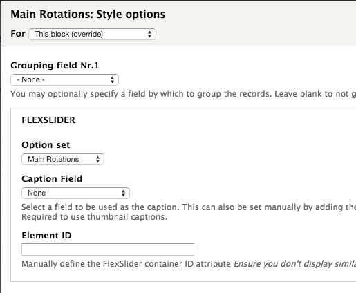
Click Settings next to the FlexSlider format and select Main Rotations** for the Option set.
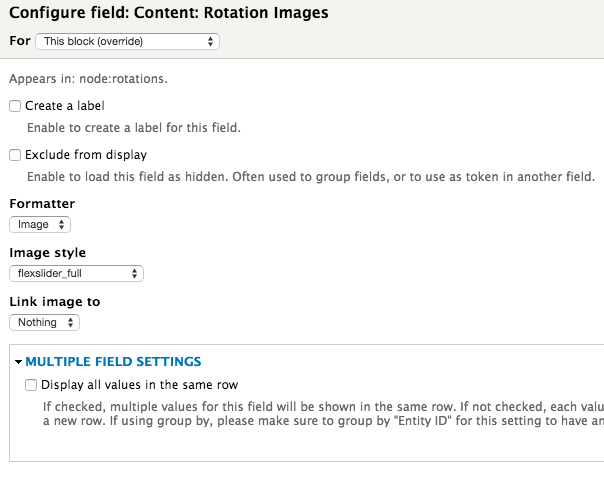
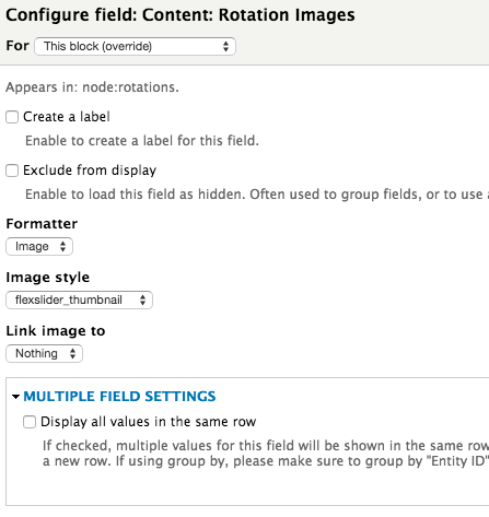
Under Fields click add. Chose an image field from your site. In my case, I created a custom content type called Rotations with an image field called Rotation Images. In my example for Formatter is set to image, my Image style is set to flexslider_full and Link image to is set to Nothing. If this field accepts multiple values, make sure Display all values in the same row is unchecked.
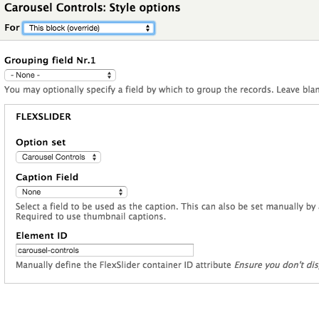
Now we need to create the carousel controls block view. The easiest way to do this is to clone the Main Rotations block we just created. Change the display name to Carousel Controls to distinguish it from the Main Rotation block view. Update the FlexSlider format settings to reflect the following (make sure you select This block (override)):
- Option Set = “Carousel Controls”
-
Element ID = “carousel-controls”
- This is crucial for syncing the two sliders
Next, update the image field image style to flexslider_thumbnail. This is because we set the Item Width to 160px in our Carousel Controls FlexSlider option set. The flexslider_thumbnail image style is set to be 160px wide.
Finally, save the view and configure the blocks to display on the page or pages you wish. In my case I placed them on the homepage of my demo site.